Brand Visual Identity
Client: Pizzacato
Date: March 2024
Date: March 2024
Pizzacato is an authentic delicious Pizza restaurant Located in Cologne, Germany.
They are specialized in making pizza for the pizza enthusiast who can detect and enjoy the subtle different between each different pizza made.
Each Pizza not only made with an exact specific ingredients but also made with love, passion and care. Their commitment not only presented in delivering a traditional Neapolitan-style pizza but also communicating a deep sensation and delivering a happy vibrant emotions with each bite.
Pizzacato mission is to combine a good taste with a unique atmospheric environment that goes well with the whole experience, to enhance their customer experience, especially when dining in their restaurant.
"From the minute our customers step through our doors, they are transported to a whole different and intimate dining space, where the aroma of freshly baked pizzas fills the air and the heart."
Once entering the restaurant customers feel as if they travelled through time to a different world, Italian Pizza world...... even before they try it or eat it, It can be sensed right away from the perception of the surrounding colors, brand visual messages, smell of the tasty pizza, the restaurant staff, people setting around enjoying their food, the music playing in the background......... Hence the tagline "Pure Italian Savour" .
Pizzacato the brand name comes from combining both words..... Pizza and Pizzicato a violin technique which mainly played by two fingers not just the bow, hence the brand name choice, the metaphorical choice purpose goes well with the brand mission, message and goal to deliver a pizza which is tasty but also artistic in its taste, smell and experience.
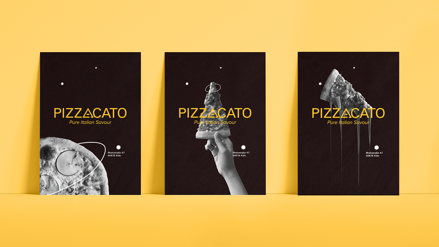
To illustrate these specific sets of emotions and encourage customers to feel it, the color yellow was a perfect choice for its warm, cheerful, enjoyable, sunny, inviting and energetic characteristic.
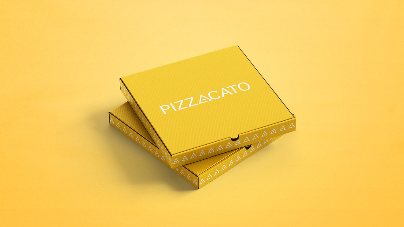
Likewise, the logo itself its a mixture of simple typography and an abstract of the two fingers which play the violin which is represented by the outer letter A shape, it is also representing both the Letter A and a slice of Pizza, Which is very personal and make it stand out not only among local brands but also the most well known international ones.
The choices of colors are Yellow, White and Black which is a very minimal approach but at the same time make the brand easily recognizable. In addition to making its use versatile and cost effective.
There are logo iteration for which it can be used to make it easily recognized in different applications and settings.
“Pizzacato: our restaurant name is derived from a music playing technique which reflects our philosophy in making our pizzas, Just like music, enjoyable, authentic, nostalgic, unique and emotional”


Brand Visual Identity
March 2024
March 2024
Client: Pizzacato
Tagline:Pure Italian Savour
Project Type: Fictional
Type of work: Brand Identity & Art Direction
Concept, Ideation, Branding & Compositing: Muhammad Gamal
Photography: Unsplash.com
Project Type: Fictional
Type of work: Brand Identity & Art Direction
Concept, Ideation, Branding & Compositing: Muhammad Gamal
Photography: Unsplash.com


